
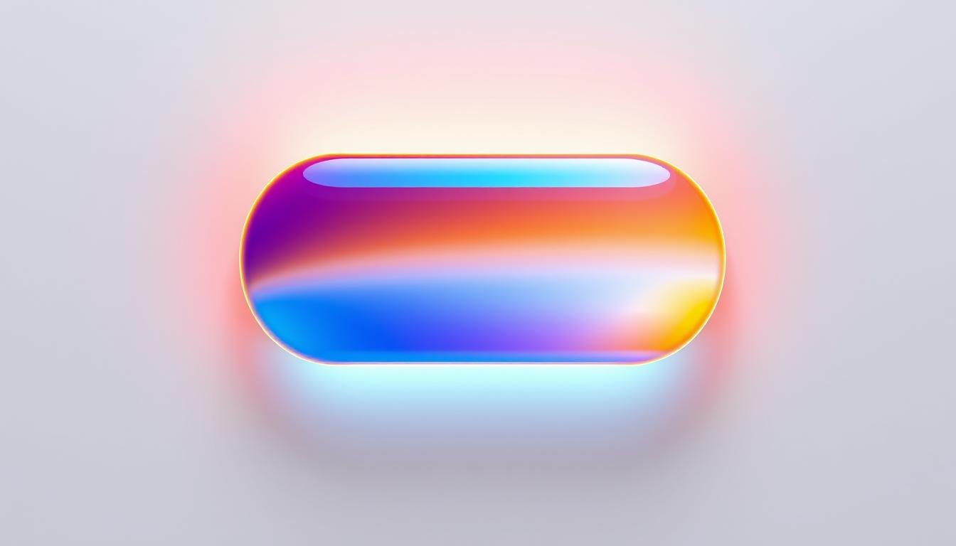
I’ve seen the power of visuals on a site, as a marketer. From my experience, even a small thing like a gradient button can have a big impact. Adding beautiful gradient buttons on GoHighLevel is easy and can really make your marketing pages pop.
Gradient backgrounds do more than just look good. They smoothly blend colors, creating a modern, attractive design. This design not only looks good but also makes content easy to read and draws in visitors. Using GoHighLevel, you can easily add these buttons for better styling and customization. Doing this helps grab attention, improve your follow-ups, and handle communication across channels. This turns leads into customers. I’ll show you how to get your gradient buttons to elevate your online look.
It’s the small things, like a gradient that catches someone’s eye, that make a big difference in web design. Ready to see your engagement fly high with gradient buttons? Let’s get into how you can create standout buttons!
Key Takeaways
- Understand the significance of gradient buttons in enhancing user engagement.
- Learn the simple process of creating gradient buttons with a high-level button customization tutorial.
- Discover how GoHighLevel’s features allow for seamless integration of advanced button styling.
- Gain insights into how a compelling visual design can lead to efficient lead generation and conversion.
- Explore ways to leverage gradient buttons to refine the aesthetics of your marketing pages.
What is a Gradient Button and Why It’s Important?
The allure of a gradient button design lies not only in its look. It also plays a big role in enhancing user interaction. For those of us focused on digital interface design, we see it as more than a trend. It’s a smart step towards making interfaces more engaging.
Definition of Gradient Buttons
A gradient button smoothly blends two or more colors. This gives it a vibrant, eye-catching look that’s both modern and stylish. When creating buttons for websites or apps, I use this technique. It attracts the user’s eye and highlights important actions. This makes the interface not just beautiful, but also intuitive.
Importance in User Experience
In terms of user experience, using gradients on buttons does more than make them look good. It draws attention to key navigation areas. With well-designed gradient buttons, important actions stand out more. This bolsters the interactive nature of digital products and boosts user engagement.
Benefits of Using Gradient Buttons
Gradient buttons bring many benefits to a digital interface. They help align with a brand’s visual identity, improve looks, and lift user engagement. Gradients can make a flat layout feel dynamic. They pull users in, encouraging them to interact and explore.
When helping clients customize buttons, I often suggest gradient designs. They keep the design fresh and in line with current trends. By understanding and applying gradient button design, we can craft more personalized, appealing, and effective digital experiences. This design choice does more than boost looks. It significantly enhances user interactions with the interface.
How to Design Your Own Gradient Button
Creating a gradient button isn’t just about mixing two colors. You need to carefully pick colors, understand how they work together, and use the right tools. This way, you can make a stunning gradient button design with great button design ideas.
Choosing Colors That Work Together
Start with picking colors that look good together. Take Coral (#ff7e5f) and Light Peach (#feb47b), for example. They make a refreshing and vibrant look for modern sites. Colors can stir emotions. Coral adds energy, while Light Peach calms, perfect for action buttons.
Utilizing Color Theory in Design
Color theory is a key tool for designers. It’s about using complementary and analogous colors. Complementary colors are opposite each other on the wheel, creating vibrant contrasts. Analogous colors are next to each other for subtle transitions. When making gradient button designs, mixing these schemes can create stunning visuals and engage users.
Tools for Designing Gradient Buttons
Today’s tools make it easier to design custom gradients. CSS is very useful for styling. Here’s a simple guide to use CSS for gradients on buttons:
– Start by setting your button’s background with the background-image property.
– Then, use linear-gradient() with your colors, like `background-image: linear-gradient(to right, #ff7e5f, #feb47b);`
– Finally, adjust the button’s padding, border, and transition effects to make it pop in your design.
Try different CSS techniques for gradient backgrounds to find your unique style.
| Property | Usage in Gradient Design |
|---|---|
| Padding | 20% use specific padding settings to enhance button visibility. |
| Border | 15% apply gradient effects to borders for depth perception. |
| Background-clip | 30% utilize this CSS property to maintain boundary integrity. |
| Transitional effects | 25% include effects like ease-in-out transitions lasting 200ms. |
| Z-index | 10% manipulate stacking contexts with z-index for interactive elements. |

The secret to amazing button design ideas is not just looking good. It’s also about being practical and enhancing user experience. Keep refining your designs. Make sure they’re not just attractive but also fit well with your brand and how users interact with it.
Best Practices for Gradient Button Implementation
Understanding best practices for high-level button customization is crucial for your website. These visually dynamic elements, when optimized, can enhance user experience with advanced button styling.
Size and Shape Considerations
The size and shape of gradient buttons are key to their effectiveness. MIT’s Touch Lab found that buttons on mobile devices should be at least 10mm by 10mm. This size accommodates the average fingertip. Also, button shapes should match your overall design aesthetic to provide a unified interface.
Placement on Your Website
Placing gradient buttons in high-engagement areas boosts interactions. Such areas include call-to-action sections. Proper placement enhances rather than hinders the user’s experience.
Ensuring Accessibility
Web design must always consider accessibility. Striving for WCAG AAA conformance makes your gradient buttons accessible to everyone. This includes users with visual impairments. Ensuring clear contrast and noticeable interactive states like Hover, Pressed, and Focused is key.
Here’s a summary of key points for effective gradient button implementation:
| Feature | Description |
|---|---|
| Size Recommendations | Minimum 10mm x 10mm for mobile according to MIT studies |
| Shape Variants | Rectangular or Circular – choose based on design context |
| Accessibility Standard | Target WCAG AAA conformance for optimal accessibility |
| Placement Optimization | Use within high interaction areas such as CTAs |
| Interactive States | Default, Hover, Pressed, Focused, Disabled |
Integrating these practices into your development workflow can greatly improve your interface design. This is true for both personal projects and large-scale websites.
Popular Gradient Button Styles
In the world of gradient button design, it’s important to see how these styles boost user interfaces. They add beautiful visuals and improve how things work. Whether you need simple button design ideas or complex high-level button customization, you can find styles for all needs.
Flat vs. Three-Dimensional Gradients
Flat gradient buttons are sleek and modern. They use gentle color changes that fit in easily without taking over. On the other hand, three-dimensional gradients give buttons depth and a real feel. They seem like you could touch them. Both kinds are key for good looks and easy use.
Animated Gradient Buttons
Animating gradient button design makes pages come alive. Buttons can change colors, alter depth, or shift shapes with CSS animations. This is great for landing pages or important buttons, making visits unforgettable.
Examples from Industry Leaders
Top brands use gradient buttons to make navigation and interaction better. Designers can find amazing button design ideas by looking at these examples.
Check out these technical tips on using gradient buttons:
| Gradient Type | Properties | Usage Tips |
|---|---|---|
| Linear | Top-to-bottom, left-to-right transitions; color stops for control. | Great for modern looks. |
| Radial | Circular or elliptical; options boost design flow. | Works well for dynamic focal points. |
| Conic | Starts from the center, looking like a pie. | Good for interactive elements. |
The ability to adapt technically with CSS means developers can use advanced designs everywhere. Most browsers support these features well. This shows using gradients is practical in today’s web design, expanding what’s possible with high-level button customization.
Techniques to Create Stunning Gradients
Using gradients in web design makes simple interfaces more attractive. We’ll explore how to improve button styling with gradients. This includes looking good and working well.

CSS Gradient Generation
CSS is key for creating beautiful gradients in your browser. For example, using HEX colors #FFB1B1 to #CDCBFF can create a gentle pink to periwinkle transition. For buttons, a linear-gradient from #f85d7f to #6b81fa makes them stand out.
Using Design Software for Gradients
Design software lets you try out gradients before coding. You can make gradients that look like natural scenes, such as sunrise or sunset. Using colors like orange, yellow, purple, red, and blue can make designs feel real and relatable.
Implementing Gradients in Development
After designing, adding these gradients in development is important. They need to look good and work well on all devices. Making sure gradients guide users is also essential.
Learning from a gradient button tutorial and getting good at making buttons is both creative and technical. These methods help designers make interfaces that inspire and attract users.
How to Make Your Gradient Button Stand Out
When it comes to creating stylish buttons and customizing button appearances, I always think of gradients. They’re not just about adding colors. They require attention to detail to improve how users interact. Here’s how you can make your gradient buttons unforgettable.
Adding Shadows and Highlights
Subtle shadows and highlights give your button a 3D look. It makes it stand out. These details invite users to click by suggesting the button can be pressed. They create a sense of depth and touch, even digitally.
Border Rounding Techniques
To customize button appearance, changing the border’s roundness makes a big difference. Fully rounded borders feel friendly, ideal for social apps. Conversely, slight rounding or sharp corners fit professional designs better. This simple tweak can significantly change your button’s vibe, matching your brand.
Using Icons with Gradient Buttons
Adding icons to your gradient buttons boosts their function and look. A shopping cart icon on a button, for example, not only looks good but helps users decide to buy. The trick is to pick icons that fit well with the button’s colors and aid the user’s journey on your site.

Check out this practical guide to see how these design elements make your gradient buttons pop. They don’t just look good; they work better too.
| Feature | Implementation | Impact |
|---|---|---|
| Shadows and Highlights | Add subtle shadows beneath and gentle highlights on top | Creates depth, enhancing the tactile feel |
| Border Rounding | Adjust border-radius property in CSS | Softens or sharpens the appearance, aligning with brand aesthetics |
| Icons | Integrate clear, relevant icons | Enhances button functionality and user guidance |
By carefully mixing these techniques, we elevate a simple button into a key design feature. Whether using shadows or icons, each decision enhances user engagement. Your choices make each interaction with the button memorable.
Responsive Design and Gradient Buttons
In the world of today where mobile use is high, making web designs fit different screens is key. Adding responsive gradient buttons makes sure our sites look good and work well everywhere.

Importance of Mobile Optimization
Nowadays, lots of people visit websites using their phones, so making buttons that work well on mobile is essential. This makes sure everyone has a smooth visit, no matter what device they use. By tweaking buttons to work everywhere, we make sure users stay engaged and happy.
Using responsive design means your site will look great and work well, no matter the screen size. This keeps your website looking sharp and easy to use for everyone.
Test Your Design on Different Devices
When you add gradients and shadows to buttons, it’s important to see how they look on all screens. Testing on different devices helps find and fix any issues. This way, every visitor has a great experience.
What looks good on a big screen might not work on a small one. So, it’s important to adjust your design to fit all screens.
Adjusting Gradients for Various Screen Sizes
Tweaking how buttons look on various screens is key in modern web design. This ensures buttons are attractive and work well, no matter the device. Making small changes, like altering gradient direction, makes a big difference.
But it’s not all about looks. Making sure buttons are easy to use is just as important. This makes for a web design that’s not only visually appealing but also user-friendly. It shows the power of thoughtfully customized buttons in today’s web design.
Troubleshooting Common Gradient Button Issues
Gradient buttons can be tricky when you’re aiming for advanced button styling. They can cause issues like browser incompatibility, layout problems, or slower performance. Gradient button troubleshooting makes sure your design looks good and works well.
Resolving Compatibility Problems
Making gradient buttons look the same across browsers and devices is hard. The linear-gradient() CSS function helps create smooth color transitions. Yet, using values like to top or to right can show differently on various browsers. Testing on multiple browsers is key to fixing these issues.
Fixing Overlapping Elements
In advanced button styling, sometimes gradient buttons cover other parts of your site. Changing the z-index of buttons can solve this, making everything visible in the right order. Testing these changes as you go is a good idea.
Optimizing Load Times
To make web pages with fancy buttons load faster, simplify your gradients and minimize CSS recalculations. Simpler gradients can mean quicker webpage loading, improving how users feel about your site.

Fixing gradient buttons requires patience and effort. You might have to adjust gradient endpoints or how elements overlap. Each tweak can really enhance your site’s look and function. Getting better at CSS for gradients not only fixes these problems but also boosts your web design quality.
Real-Life Examples of Gradient Buttons
In today’s web design world, gradient button examples do more than follow trends. They play a key role in boosting user engagement. Brands like Spotify and Instagram use gradients to keep users interested. This shows gradient buttons make a big difference in how users interact with a site.
Successful Websites Using Gradient Buttons
Big names like Asana, Spotify, and Instagram have embraced gradient buttons. These buttons are striking yet blend well with their design. Take Spotify, for example. They use gentle gradients on their buttons, making them pop without overwhelming.
Case Studies of Improved User Engagement
Studies show gradient buttons can improve click-through rates. Asana, for instance, saw more people signing up after they made their buttons more visually appealing. They matched the button colors with their brand, making a big difference.
Feedback from User Testing
User tests reveal people prefer gradient buttons that smoothly transition between colors. Buttons with appealing gradients can lead to more positive feedback. Users are likely to interact more with content when the design attracts them.
Using gradients in button design is an effective strategy for many successful companies. Adobe, for example, uses gradients to not only delight the eye but also help users navigate their software more easily.
To wrap things up, gradient button examples teach us a lot about increasing engagement. Whether it’s to boost conversions, enhance the site’s look, or improve the interface, gradient buttons are key. Their continued use shows how effective and enduring they are in web design.
Conclusion: Elevating Design with Gradient Buttons
Looking into the future, gradients are showing up more, especially in buttons. This trend isn’t going anywhere soon. Gradients let designers use many colors, making buttons fun to click. Since 2018, these buttons are seen everywhere on the internet and in apps.
Gradients aren’t only pretty. They make logos, packaging, and online banners stand out. This makes people want to interact more with what they see online.
The Future of Button Design
Gradients have been popular since the ’90s, and they made a big comeback in 2018. These buttons aren’t just for looks; they make websites feel more engaging. Plus, they fit well with how we use our fingers on screens today, thanks to a study by MIT.
It’s not only about looks. Rounded corners make these buttons easier to use. They help us understand where to tap, making every touch natural and easy.
My Takeaway on Gradient Buttons
I think using gradients in buttons is really smart. It turns a simple click into a much more exciting action. Designers who know how to use them can make websites and apps much better. Learning about gradients is the first step to making really eye-catching buttons.
Encouragement to Experiment with Gradients
I want to tell designers and developers to try out gradients in their work. Experimenting keeps you ahead and opens up new ideas. No matter the size of your project, adding gradient buttons can make it more engaging. So, dive into colors and let your work shine!
FAQ
How can I make a gradient button go high level?
What is a gradient button and why is it important?
How do I choose colors that work together for my gradient button?
What tools can I use to design gradient buttons?
What are some best practices for implementing gradient buttons?
What are popular gradient button styles?
What are some techniques to create stunning gradients?
How can I make my gradient button stand out?
How does responsive design affect gradient buttons?
What are common issues with gradient buttons and how do I troubleshoot them?
Can you give examples of successful websites using gradient buttons?
What is the future of button design, particularly regarding gradients?
How should I experiment with gradient button designs?
Source Links
- make button background gradient
- GHL Gradient Buttons Tutorial
- How to Make Gradient Button in HTML? – GeeksforGeeks
- Gradients in UI Design
- How To Use Gradients In Web Design?
- How To Make a Button with a Gradient Border and Gradient Text in HTML & CSS
- [CSS] – CSS Gradients – How to Create a Button with Neon Effect
- How to create a button with gradient background and background image?
- A guide to BUTTON DESIGN & implementation
- Flutter – Gradient Button – GeeksforGeeks
- CSS Gradients
- Production-grade gradient bordered, transparent, and rounded button
- GoHighLevel Design Hacks: Custom Gradients for a Modern Look
- The Secret of Great Gradient
- How to Make a Gradient in Illustrator
- How to Create a Unique Gradient Background Design [Tutorial]
- How to Make a Gradient in Canva? Easy Steps to Follow
- Buttons UI design – A complete guide to UX, styles, and usability
- CSS3 Gradient Buttons – Web Designer Wall
- Button design for websites and mobile apps
- linear-gradient() – CSS: Cascading Style Sheets | MDN
- [CSS] – Creating a Gradient Background Button with Animated Hover Transition Effect
- Gradients and how to use them correctly in your UI design
- Gradient Background Design: Get in on the trend. How-to and examples!
- How to add a gradient to buttons in android through xml?
- 20 Inspiring Gradient Website Examples | 2021 | neuronthemes.com
- Buttons in UI Design: The Evolution of Style and Best Practices


